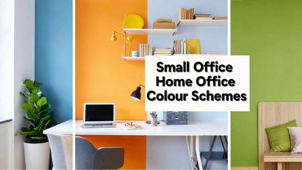
Creating a productive and inspiring small office home office (SOHO) environment is crucial for success and well-being. More than just furniture and technology, the colours you choose for your workspace can profoundly impact your mood, focus, and overall productivity.
A thoughtfully selected colour scheme can turn a cramped corner into a spacious retreat or a dull room into a vibrant hub of creativity.
This comprehensive guide will delve into the psychology of colour, practical considerations for small spaces, and a wealth of specific paint colour ideas to help you design the perfect SOHO. Whether you seek tranquility, energy, or enhanced focus, understanding the nuances of home office colour schemes is your first step towards a more effective and enjoyable workday.
Let’s explore how to paint your path to a more productive personal office.
How to Choose Paint Colors for Home Offices
Selecting the ideal paint colours for your home office goes beyond personal preference. Several critical factors should influence your decision to ensure the space is both aesthetically pleasing and functionally optimized for work. Consider the room’s natural light, its size, and the type of work you primarily perform within it.
The amount of natural light a room receives is paramount. North-facing rooms tend to get cooler, indirect light, benefiting from warmer tones to prevent a cold feeling. South-facing rooms, conversely, are bathed in warm, bright light, allowing for a wider range of cool or warm colours without feeling overwhelmed. East-facing rooms get morning sun, making cool, calming colours good for afternoon work, while west-facing rooms benefit from colours that can handle the intense afternoon light.
Key point: Understand your room’s orientation to natural light before selecting colours.
Your work tasks also play a significant role. If your work requires intense focus and analytical thinking, cool, muted tones like blues and greens can promote concentration. For creative tasks or brainstorming, more vibrant or inspiring colours like yellows or oranges might be beneficial, albeit used sparingly in small offices.
Lastly, consider your existing decor and personal style. The office should feel like an extension of your home, maintaining a cohesive flow while still serving its distinct purpose. A colour that clashes with adjacent rooms or your chosen furniture might create an unsettling visual discord.
The Best Home Office Paint Colors
Certain colours are repeatedly championed for home offices due to their known psychological effects. These shades tend to strike a balance between stimulating productivity and fostering a sense of calm, crucial for sustained work. Understanding these benefits can guide your initial choices.
Blues are perhaps the most popular choice, renowned for their calming and stable qualities. Light to medium blues can reduce stress and promote clear thinking, making them excellent for tasks requiring concentration. They are often associated with productivity and logic.
Greens are another strong contender, especially those with earthy or muted tones. Green is linked to nature, bringing a sense of balance, harmony, and renewal to a space. It can reduce eye strain and promote a feeling of well-being, ideal for long hours at a computer.
Grays, particularly warmer greiges, offer a sophisticated and neutral backdrop. They provide a stable and non-distracting environment, allowing for pops of colour in accessories. Grays are versatile and can be paired with almost any other colour, acting as a grounding force.
For those seeking a touch of warmth, soft yellows or creams can inject optimism and creativity without being overly distracting. Use these as an accent or in very pale shades, especially in a small office, to avoid an overwhelming effect. These colours can brighten a space and lift the mood.
Home office paint color ideas
Moving beyond general categories, let’s explore more specific home office paint colour ideas that resonate with different work styles and aesthetic preferences. These ideas blend psychology with practical application, offering tangible starting points for your SOHO transformation.
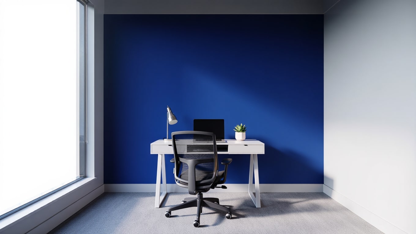
A sophisticated deep navy blue can create an executive feel, promoting serious focus and intellectual depth. Pair it with crisp white trim and light wood furniture to prevent the space from feeling too dark. This combination exudes professionalism and quiet confidence.
For a more serene and contemporary vibe, consider a muted sage green. This colour is incredibly versatile, working well with natural wood tones and metallic accents. Sage green promotes tranquility and creativity, making it perfect for designers or writers.
If you prefer warmth, a warm greige or a very light taupe can provide a comforting yet professional atmosphere. These neutrals allow for flexibility in decor and can make a small space feel larger and more inviting. They are excellent for creating a minimalist or Scandinavian-inspired office.
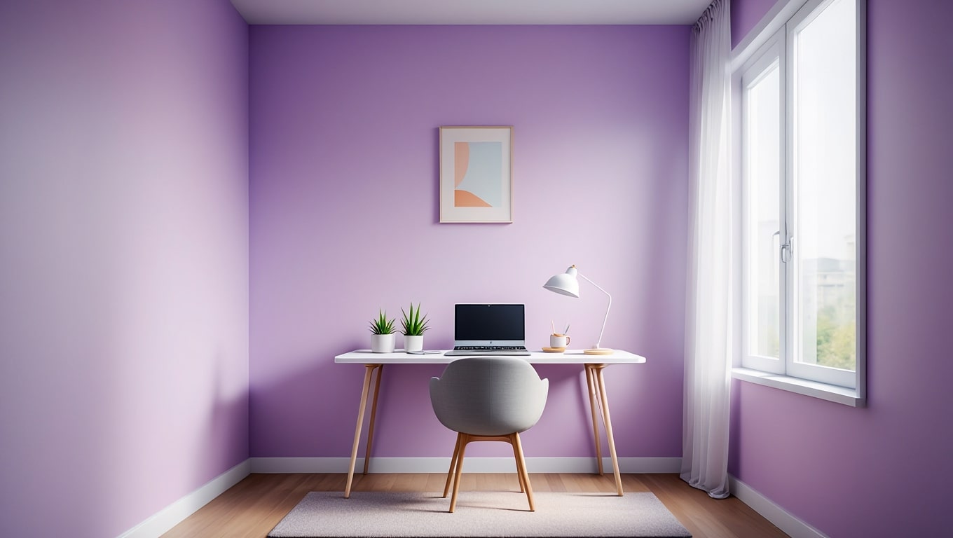
Don’t shy away from subtle pastels. A whisper of lavender or a soft powder blue can introduce a calming, almost ethereal quality, particularly effective in offices where stress reduction is a priority. These soft hues are uplifting without being overly energetic.
Best colors to paint a small office
Small office spaces present unique challenges, and colour choice can significantly impact how expansive or restrictive the room feels. The goal is to maximize the perception of space while maintaining an inspiring and functional environment. Light and cool colours are typically your best allies here.
Light, airy colours are essential for making a small office feel larger and more open. Whites, off-whites, and very pale pastels reflect light, visually pushing walls outwards. Consider shades like soft cloud white, pale sky blue, or a delicate mint green.
Cool tones tend to recede, creating an illusion of depth. Light blues and greens are excellent choices, as they not only expand the space visually but also contribute to a calm and focused atmosphere. A pale gray with blue undertones can also work wonders.
Avoid overly dark or highly saturated colours on all walls in a small office, as they can make the space feel claustrophobic. If you love a bold colour, consider using it on a single accent wall, ideally the wall behind your desk or against which your main furniture sits, to draw the eye without overwhelming the room.
Key point: Utilize lighter, cooler tones to visually expand small home office spaces.
Favorite Paint Colors for Home Offices
While personal taste varies, certain paint colours consistently earn high marks for their suitability in home office settings. These “favorites” are often praised for their ability to foster productivity, reduce stress, or simply create an aesthetically pleasing workspace. They are tried-and-true choices that designers and homeowners frequently recommend.
A perennial favorite is Benjamin Moore’s “Hale Navy.” This deep, sophisticated blue brings a sense of tradition and gravitas, ideal for those seeking a distinguished and highly focused environment. It pairs beautifully with brass accents and rich wood tones.
Sherwin-Williams’ “Sea Salt” is another beloved option. This soft, muted green-blue-gray chameleon colour adapts beautifully to different lighting conditions, providing a calming and refreshing backdrop. It’s perfect for creating a tranquil, spa-like workspace.
For a crisp, clean, and endlessly versatile neutral, Farrow & Ball’s “Skimming Stone” (a warm off-white) or Benjamin Moore’s “Revere Pewter” (a classic greige) are top contenders. These colours provide a refined canvas that allows artwork and furniture to shine, offering a sophisticated yet unobtrusive setting for any work.
Lastly, a soft, pale yellow like Sherwin-Williams’ “Compatible Cream” or Benjamin Moore’s “Linen White” can inject a subtle cheerfulness and warmth without being overly stimulating. These gentle yellows are excellent for spaces that lack natural light, instantly brightening the atmosphere.
The Importance of Sheen in Office Paint Colors
Beyond the colour itself, the paint’s sheen, or finish, significantly impacts the overall look, feel, and durability of your home office. Different sheens reflect light differently and offer varying levels of resilience, making the choice crucial for both aesthetics and practicality.
Flat or Matte finishes absorb light, creating a rich, velvety appearance. They are excellent for concealing wall imperfections and offering a sophisticated, non-reflective surface. However, they are less durable and harder to clean, making them best suited for low-traffic areas or ceilings.
Eggshell and Satin finishes are popular for home offices. Eggshell has a slight sheen reminiscent of an eggshell, offering more durability and washability than flat. Satin has a slightly higher luster, is very durable, and easy to clean, making it ideal for walls that might see occasional bumps or marks.
Semi-Gloss and High-Gloss finishes are highly reflective and very durable, standing up well to scrubbing. They are typically reserved for trim, doors, and cabinetry, as their high sheen can be too distracting on large wall surfaces, especially in a small office where light reflection can be intense.
Key point: Eggshell or satin finishes offer the best balance of aesthetics and durability for home office walls.
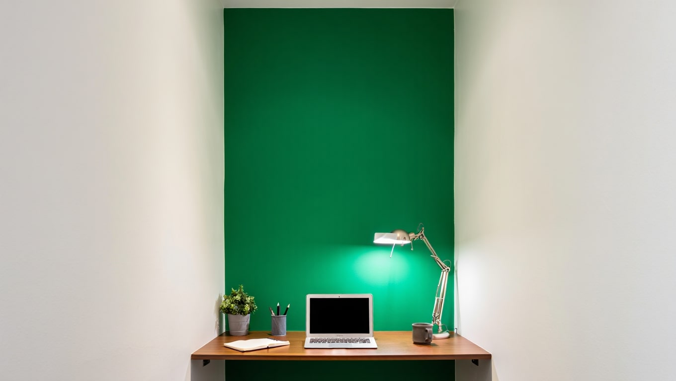
Soft warm neutrals with a single accent wall
This classic colour scheme is particularly effective for small office home offices, offering a perfect blend of serenity and visual interest. It leverages the calming and expansive qualities of neutrals while allowing for a burst of personality or energy on a single wall. This approach prevents overwhelming a compact space with too much colour.
Start with soft warm neutrals like greige, warm off-white, or a pale taupe for the majority of the walls. These colours create a light, airy, and inviting foundation, making the room feel larger and more open. They also provide a versatile backdrop that harmonizes with almost any furniture style.
For the accent wall, choose a colour that either complements your neutral base or provides a deliberate contrast. A deep navy, a rich emerald green, or even a soft terracotta can add depth and character. This accent wall is often the one behind your monitor or desk, providing a pleasant focal point during work.
The key is balance. Ensure the accent colour is one that you find inspiring or calming, rather than overly stimulating. This scheme allows you to inject personality and creative energy without sacrificing the peaceful atmosphere essential for productivity in a small space.
Deep jewel tone on the working wall
For those who appreciate bold sophistication but are limited by space, applying a deep jewel tone on the “working wall” is an excellent strategy. The working wall is typically the one directly in front of you or behind your desk, the one you face most frequently during your workday. This approach leverages the richness of vibrant colours without making the entire small office feel closed in.
Imagine a luxurious emerald green, a profound sapphire blue, or a regal amethyst purple on this single wall. These colours evoke a sense of drama, depth, and creativity. They can inspire focus and a feeling of gravitas, perfect for professional or artistic pursuits.
To balance the intensity, keep the remaining walls in a very light, neutral shade – think crisp white, pale grey, or a muted beige. This contrast ensures that the jewel tone is celebrated as a feature rather than an engulfing element. White trim and ceiling paint will further enhance this effect, making the space feel taller and brighter.
Key point: A single jewel-toned wall adds drama and focus without overwhelming a small office.
Two-tone vertical split for height illusion
In small offices, especially those with lower ceilings, creating an illusion of height can significantly enhance the feeling of spaciousness. A two-tone vertical split paint scheme is a clever design trick to achieve this, drawing the eye upwards and making the walls appear taller than they are.
To implement this, divide the wall horizontally, typically at two-thirds or three-quarters of the way up from the floor. Paint the lower section a slightly darker or more saturated colour, and the upper section, including the ceiling, a lighter, airier shade, preferably white or a very pale neutral.
The lighter colour on the upper portion and ceiling visually lifts the space, making it feel less constrained. For the lower section, you could choose a muted blue, a soft green, or even a warm grey. The key is to ensure the contrast isn’t too stark, maintaining a harmonious flow.
This technique is particularly effective in a small home office where every visual trick to enhance space perception counts. It adds architectural interest and depth without adding clutter or complexity, contributing to a sense of calm and openness.
Biophilic greens and soft nature-inspired palettes
Bringing the outdoors in is a powerful strategy for enhancing well-being and productivity, especially in a small home office lacking direct access to nature. Biophilic design, which incorporates elements of the natural world, suggests that greens and other nature-inspired palettes can reduce stress, improve focus, and boost creativity.
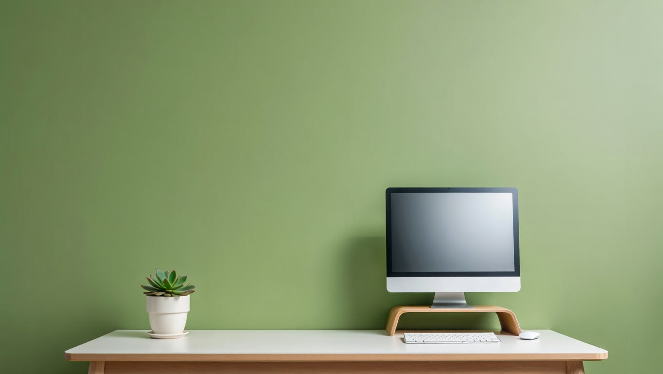
Consider a range of greens, from a soothing sage to a vibrant moss or a deep forest green. These colours are inherently calming and provide a refreshing backdrop. They are particularly effective when paired with natural materials like wood, rattan, or cork, and of course, actual plants.
Beyond greens, a nature-inspired palette can include soft blues reminiscent of the sky or water, warm browns like earth or tree bark, and even muted sandy beiges. The goal is to create a harmonious, organic feel that promotes tranquility and concentration.
In a small office, opt for lighter shades of these nature-inspired colours to maintain an airy feel. If using a deeper green or blue, consider it for an accent wall or combine it with lighter neutrals. This approach helps to cultivate a sanctuary where ideas can flourish.
Writable wall or chalkboard with a pop of color
Combine functionality with creative expression by incorporating a writable wall into your small office or home office. This innovative design choice not only provides a dynamic surface for brainstorming and note-taking but also offers a unique opportunity to introduce a pop of colour and texture.
Whiteboard paint transforms any wall into a dry-erase surface, perfect for jotting down ideas, schedules, or quick calculations. While typically white, you can also find clear whiteboard paint that allows your underlying wall colour to show through, offering a subtle pop against your main scheme.
Chalkboard paint, on the other hand, provides a more tactile and rustic option, usually in deep black or dark grey. This can create a dramatic accent wall, particularly effective when balanced with lighter wall colours. The dark surface offers a strong contrast, making written notes stand out.
Key point: A writable wall adds both functionality and a unique visual element to your SOHO.
To integrate a pop of colour, choose a vibrant shade for the surrounding walls or for accessories. For instance, a white writable wall could be flanked by walls painted in a cheerful yellow, or a chalkboard wall could be complemented by a bright red office chair or a vivid piece of art.
Pros and Cons of Popular Home Office Paint Colors
Choosing the right colour involves understanding not just its benefits but also its potential drawbacks. Different colours evoke different responses, and what works for one individual or type of work might not be suitable for another. Here’s a comparison of popular home office paint colours:
| Color | Pros | Cons |
|---|---|---|
| Blues (Light to Medium) | Promotes calm, focus, productivity; reduces stress; feels stable and intellectual. Great for analytical work. | Too much blue can feel cold or uninviting; it can be perceived as sad or passive if too dark/grey. |
| Greens (Muted/Earthy) | Harmonious, balanced, reduces eye strain; linked to nature and growth; promotes well-being and creativity. | Overly bright greens can be too stimulating; some shades might appear dated if not chosen carefully. |
| Grays/Greiges | Sophisticated, neutral, versatile; provides a stable, non-distracting backdrop; makes small spaces feel larger. | Can feel dull, cold, or uninspiring if not balanced with textures, art, or warm accents. |
| Yellows (Soft/Pale) | Uplifting, cheerful, promotes optimism and creativity; brightens a space, especially those lacking light. | Too much yellow or a saturated shade can be overstimulating, cause anxiety, or be distracting. |
| Whites/Off-Whites | Clean, minimalist, expands space; brightens and offers a versatile canvas; promotes clarity. | Can feel sterile, stark, or uninspired if not warmed with textures and accessories; prone to showing dirt. |
| Deep Jewel Tones (Accent) | Adds sophistication, drama, and depth; creates a focal point; can inspire creativity and professionalism. | It can make a small room feel smaller if used on all walls; it requires careful balancing with lighter colours. |
FAQ About Home Office Paint Colors
Many questions arise when selecting paint colours for a home office, especially given the importance of creating a productive and comfortable environment. Here are some frequently asked questions to help clarify common concerns and guide your decisions.
- What is the most productive colour for a home office?
- While “most productive” can be subjective, cool colours like blues and greens are often cited for their ability to promote focus and reduce stress, thereby enhancing productivity. Light greys also offer a non-distracting environment.
- Should my home office match the rest of my house?
- Not necessarily. While it’s good to maintain a cohesive flow, your home office can have its own distinct personality and colour scheme tailored to its function. It should feel like a dedicated workspace.
- How do I choose a colour if my office is also a guest room?
- Opt for versatile, calming colours like soft blues, greens, or warm greys. These shades are conducive to both work and relaxation, appealing to a wider range of tastes for guests.
- Can I use dark colours in a small home office?
- Yes, but with caution. It’s best to use dark colours on a single accent wall to create depth and drama without making the space feel claustrophobic. Balance it with lighter colours on other walls and the ceiling.
- What effect does natural light have on paint colours?
- Natural light significantly alters how colours appear. North-facing rooms make colours seem cooler, while south-facing rooms warm them up. Always test paint samples on your walls and observe them throughout the day.
Small Home Office Paint Color Ideas
Designing a small home office requires strategic colour choices to maximize both perceived space and functional aesthetic. The right palette can transform a snug area into a spacious and inspiring workstation. Here are several tailored ideas for small offices.
Embrace monochromatic schemes with varying shades of a single, light colour. For instance, a soft pale blue on the walls, a slightly darker blue in accessories, and crisp white trim can create depth without adding visual clutter. This approach maintains a cohesive and airy feel.
Consider painting the ceiling the same light colour as the walls. This blurs the line between wall and ceiling, making the room feel taller and more expansive. Avoid contrasting ceiling colours if you want to visually heighten the space.
Key point: Light and cohesive colour palettes are essential for small office spaces.
For a vibrant touch without overwhelming, use a bright, cheerful colour on just a small architectural feature, such as the inside of a built-in bookshelf or a niche. This unexpected burst of colour adds personality and energy.
Another effective strategy is to use cool, receding colours like light greens, icy blues, or cool greys, especially if your office receives a lot of warm natural light. These colours push the walls back visually, making the room feel larger.
Finally, integrate mirrors. While not painting, large mirrors strategically placed on a wall painted a light colour can reflect light and the room itself, doubling the perceived space. This works beautifully with any of the light, expansive colour schemes mentioned.

Final Verdict on Home Office Paint Colors
The journey to selecting the perfect Small office home office colour schemes is a deeply personal one, yet grounded in fundamental principles of colour psychology and spatial design. There’s no single “best” colour, but rather a spectrum of choices that cater to individual needs, preferences, and the specific characteristics of your workspace.
Ultimately, the most effective home office paint colour is one that inspires you, minimizes distractions, and supports the specific type of work you do. Whether you opt for the calming embrace of blues and greens, the sophisticated neutrality of greys, or a creative accent, your chosen palette should contribute to a focused and enjoyable workday.
Remember to consider natural light, room size, and desired mood as your guiding factors. Don’t be afraid to experiment with samples and observe them in different lighting conditions. With thoughtful planning, your small home office can become a vibrant, productive, and comfortable sanctuary where your best work comes to life.
The ideal home office colour scheme balances personal preference with psychological and practical considerations for productivity and well-being.
Related Category: Business Trends